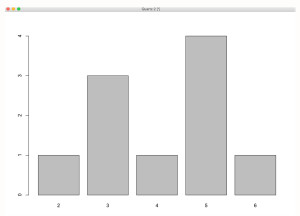
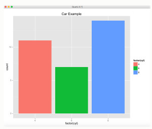
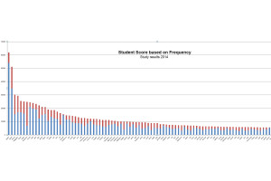
One of the biggest challenges for visualization creation is the lack of a clear methodology for how to create a good visualization design. Graphic symbols are as vital a part of our communication systems as words in the language, numbers, and formulas in statistics. Many scholars discuss the subject of visualization and statistics. They report a similar problem—that visualization, unlike statistics, has no single methodology or single grammar syntax. You can visualize data in many different ways, from simple bar charts to more complex scatterplots or heat maps, based on your experience and your own ability. Adding to the confusion, there is no single comprehensive resource on the subject of data visualization, but rather an extensive array of books, journal articles, and online websites.
Stephanie Evergreen and Ann Emery
Stephanie Evergreen and Ann Emery (2014) provided a strategy checklist to enhance the user’s experience for data visualization. The five key ideas when designing visualizations, according to Evergreen and Emery, consist of (1) supporting text description, (2) arrangement, (3) colors, (4) lines, and (5) overall meaning.
1. Supporting Text Description
Adding a text description to support the visualization may help the user. The idea of adding a text description to the visualization is to clarify the graphics. According to Evergreen and Emery (2014),
>Use a six- to twelve-word descriptive title, left-justified in upper corner.
>Add subtitles and/or annotations to provide additional information.
>Lay out text horizontally. This includes titles, subtitles, annotations, and data labels. Line labels and axis labels can deviate from this rule and still receive full points.
The first example is without any captions.
The second example is with captions.
2. Arrangement
The next term Evergreen and Emery discuss is arrangement. Improper arrangement of graph elements can confuse readers at best and mislead viewers at worst. The goal of the arrangement is getting the viewer to focus on the substance of the visualization rather than on how the visualization was developed. We will illustrate the argument by providing two examples; the first example consists of disagreement where graph elements are not clearly outlined and the second example is with agreement.
i. Example of disagreement
ii. Example with agreement
3. Colors
Colors are an important part of any visualization. We must think of colors when we apply visualization to statistical analysis. Colors are the visual perceptual properties corresponding to the categories called red, blue, yellow, and others. Based on Evergreen and Emery (2014), colors are used to highlight key patterns. Action colors should guide the viewer to key parts of the display. Less important or supporting information should be in muted colors—mix your color arrangement with white or grey, making it less bright.
4. Lines
Lines are also an important part of the visualization. Excessive line use—gridlines, border tick marks, and axes can add clutter or noise to a graph, so eliminate them whenever they are not useful for interpreting data.
Our first example below consists of gridlines that, according to Evergreen and Emery, need to be muted.
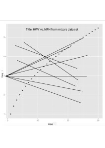
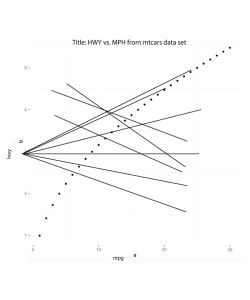
In order to mute the background in ggplot2, we used the following code:
>theme(panel.border = element_blank())
The result:
Overall meaning:
While the meaning of visualization is still a difficult subject to determine, Evergreen and Emery recommend we provide more details in order to help the user to better understand the visualization.
An important goal of any research scientist is the publication of the results of a completed study. Most academic and professional publications in our field require the researcher to provide a written document, based on their style that includes specifics of data analysis and data collection methods, in order for it to be accepted for review. Although the written word is still the dominant platform for reporting statistical analysis results and recommendations, visualization has gained recognition. Researchers who employ statistical analyses in their studies often incorporate visualization graphics to help users see the results of the analysis.
Want to learn more? Click here to buy this book
Previous, Chapter 16, Advanced Visualization Display

